[HFT] Leaky Bucket: FPGA-Based Order Flow SimulationDescription:
This indicator is a functional simulation of a hardware-based "Leaky Bucket" algorithm, typically used in FPGA (Field-Programmable Gate Array) chips for High-Frequency Trading (HFT) and network traffic shaping.
Unlike standard volume indicators (like OBV or CMF) that rely on floating-point Moving Averages (EMA/SMA), this script uses Bitwise Integer Math to simulate hardware registers. This approach removes the lag associated with smoothing and provides a raw, "tick-by-tick" representation of Order Flow exhaustion.
█ Underlying Concepts (How it works)
Integer Math & Bitwise Logic: The script eschews standard float calculations for int registers. Instead of division, it uses Bitwise Right Shift (>>) to simulate the "leak" rate. This mimics how hardware processes data streams with near-zero latency.
The Leaky Bucket Model:
Flow (Input): Volume * Price Delta flows into a "Bucket" (Accumulator Register).
Leak (Output): The bucket leaks at a constant rate determined by the Decay Shift.
Saturation: If the Flow > Leak, the bucket fills. We simulate a 32-bit integer saturation limit (sat_limit). When the bucket hits this limit, it represents "Panic Buying/Selling" — the market capability to absorb orders is saturated.
█ Uniqueness & Originality This is custom-built code, not a mashup of existing indicators. It translates hardware logic (Verilog/VHDL concepts) into Pine Script:
It introduces a "Saturation Warning" mechanism that detects when volume pressure exceeds mathematical limits.
It implements a "Gray Line" Strategy, focusing on volatility decay rather than momentum initiation.
█ How to Use: The "Gray Line" Strategy
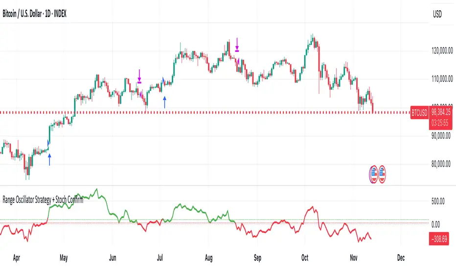
This tool is designed for Mean Reversion and Exhaustion Trading, specifically on M1 to M5 timeframes.
Do NOT trade the breakout: When you see massive Green (Long) or Purple (Short) bars, this indicates "Extreme Momentum". Do not enter yet. Wait.
Wait for the "Gray Line": The signal is generated when the Extreme Momentum stops and the bar turns Gray (Neutral).
Signal L (Long): Generated when a sequence of Extreme Short bars (Purple) ends, and the histogram returns to Gray/Maroon. This confirms sellers are exhausted.
Signal S (Short): Generated when a sequence of Extreme Long bars (Green) ends, and the histogram returns to Gray/Teal. This confirms buyers are exhausted.
█ Disclaimer This script is intended for educational purposes regarding HFT algorithms and Order Flow analysis. It does not provide financial advice.
Pine Script® indicator